Graphic design takes a lot of creativity, and sometimes that creativity can be seen as something totally different. Here are 25 graphic design fails we can’t believe. Check out the weird card on #17!
25. Upside Down Exit
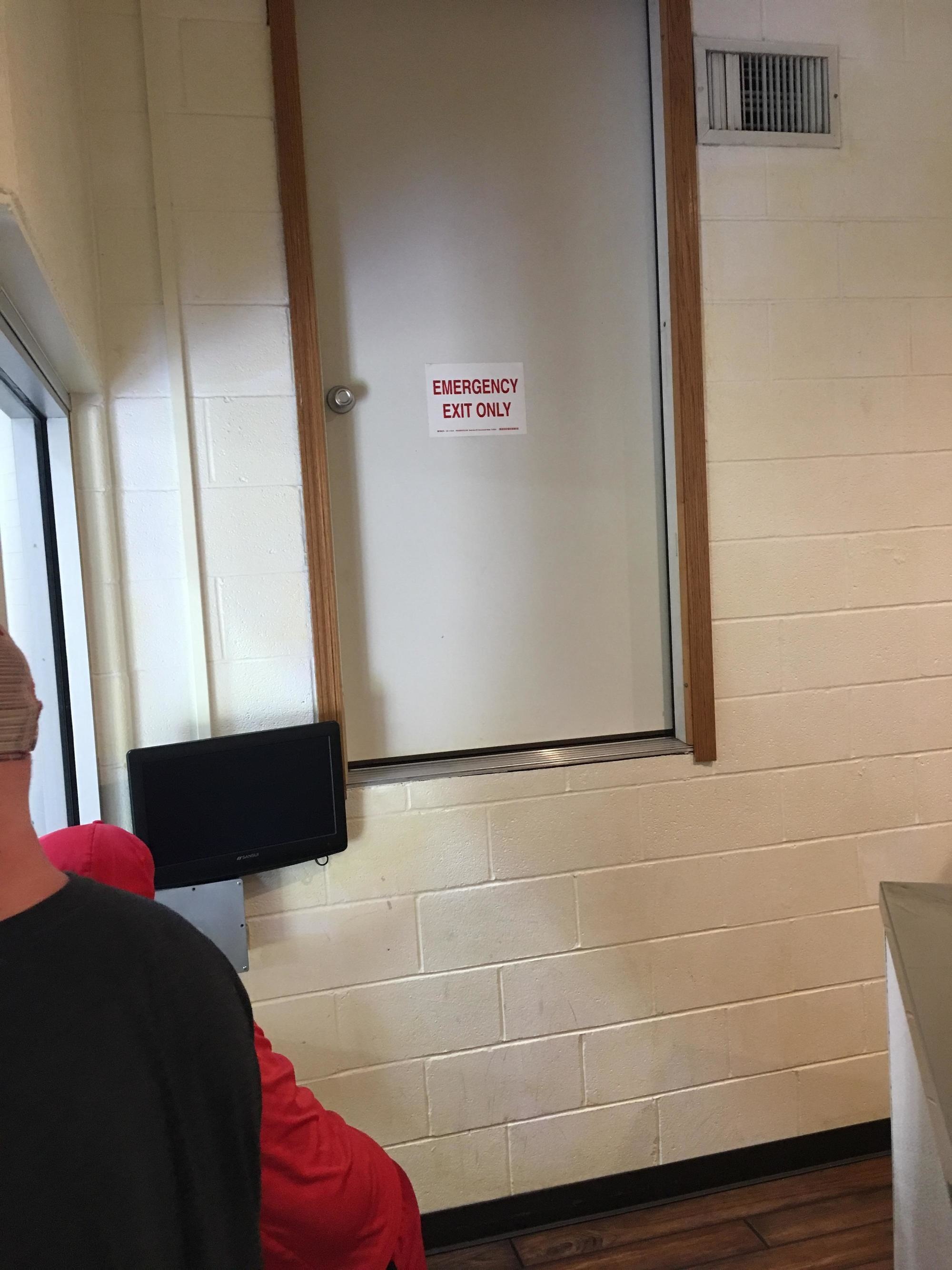
Hopefully there isn’t an emergency, unless the emergency is anti-gravity…
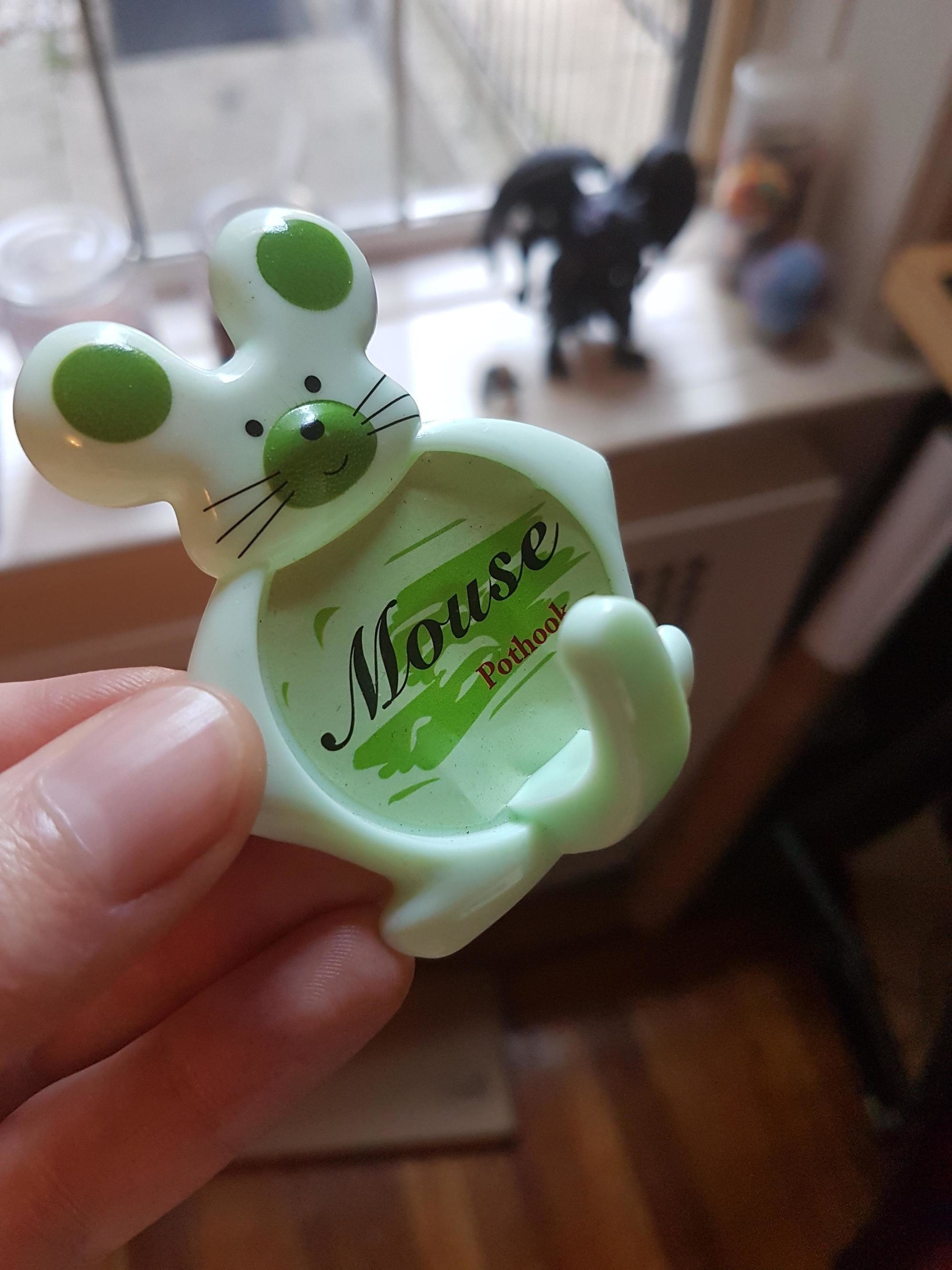
24. Excited Mouse
This mouse will hold your pots…with its tail? What’s going on here? They clearly didn’t think this through.
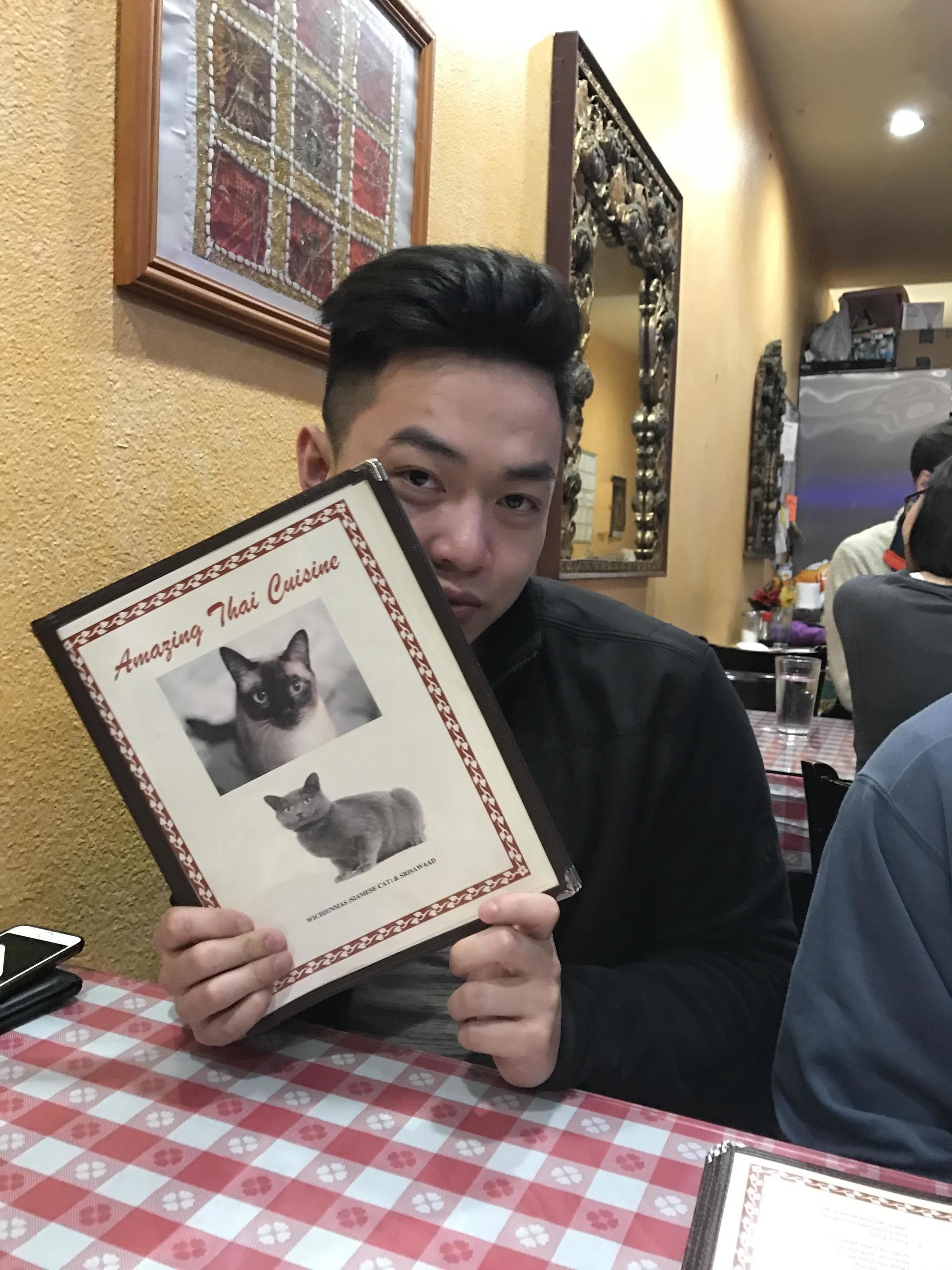
23. Amazing Kitty Cuisine
This Thai restaurant advertises their cuisine as cats… I’m pretty sure that’s not sanitary. Maybe they really like their cats and those are their family cats.
22. Eat it First
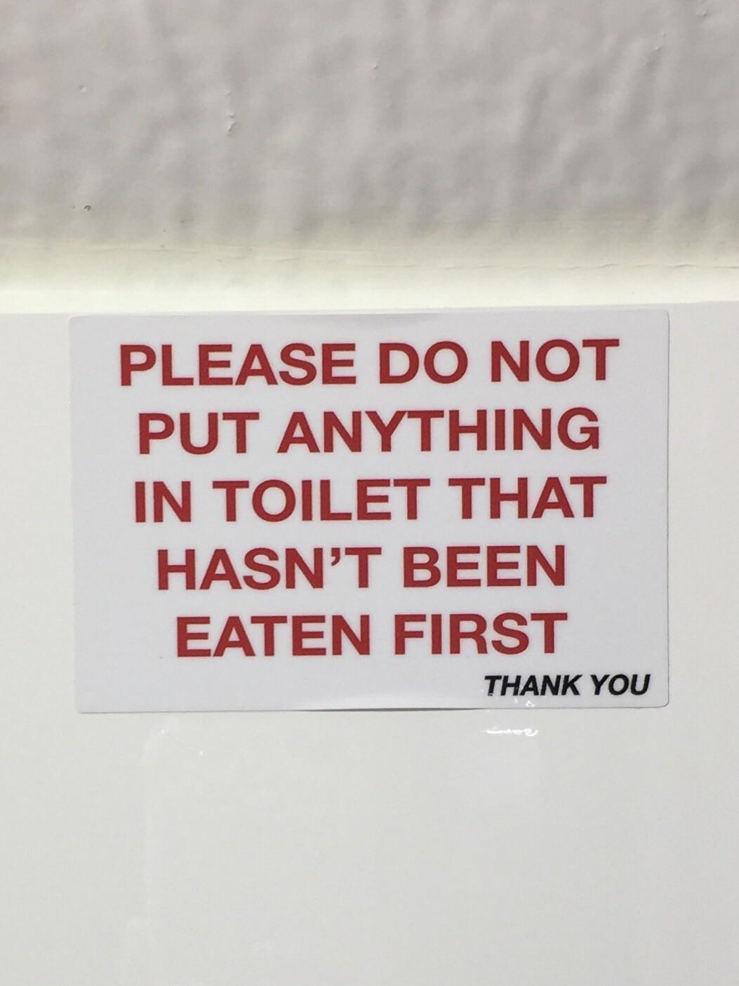
Make sure to eat your food before you flush it! Think about this a minute. Ew. Gross.
21. Four Less What?
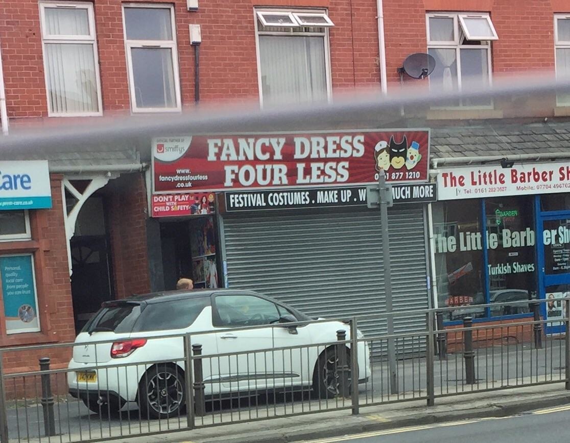
Four less dollars? What a steal! Why is “festival” and “costumes” correct on the sign?
20. Compass Pillows
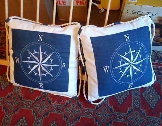
Remember the little trick you had in grade school to remember N, E S, W? Never Eat Soggy Waffles. Apparently this design thought it was Never Soggy Eat Waffles.
19. Frozen Toothbrush
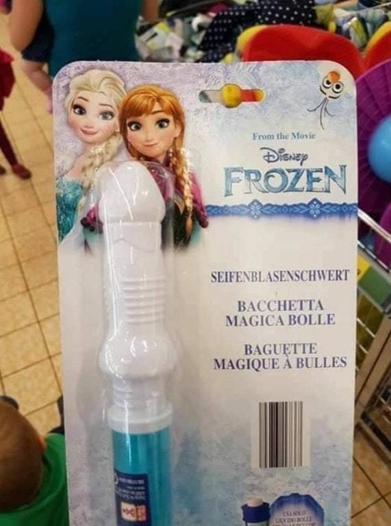
One might want to think twice before getting this for their kids… That doesn’t look like a toothbrush at all.
18. Too Much
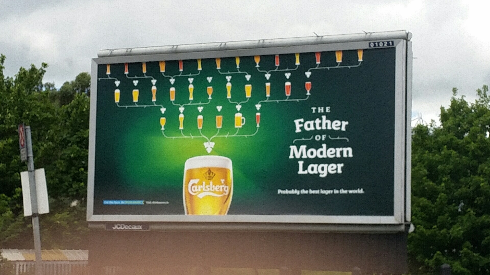
The amount of text is just too much to be on the side of a road, people will get in accidents if they try and read this! Less is more.
17. Heart With Words in it You!
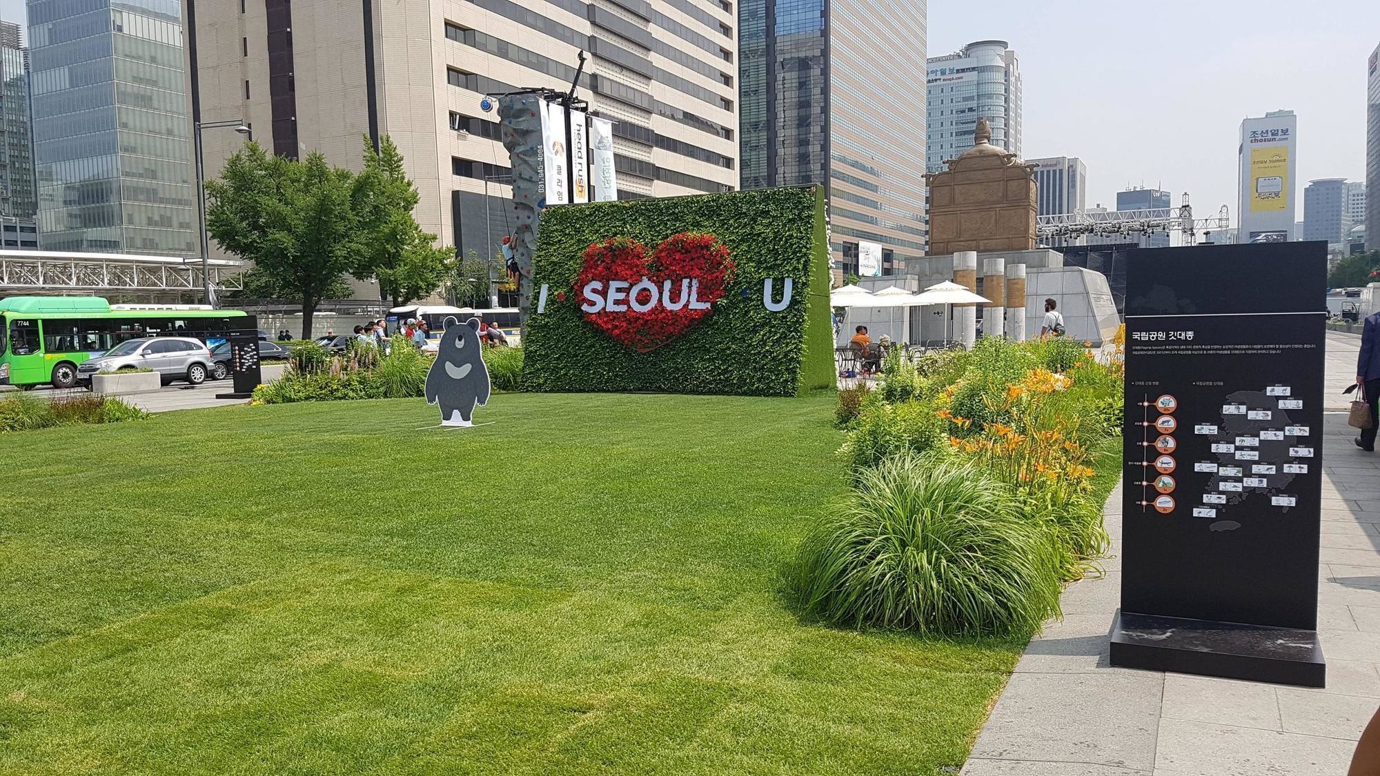
I seoul you? Not a sentiment I’d expect to hear from a sweetheart.
16. Dark Twist
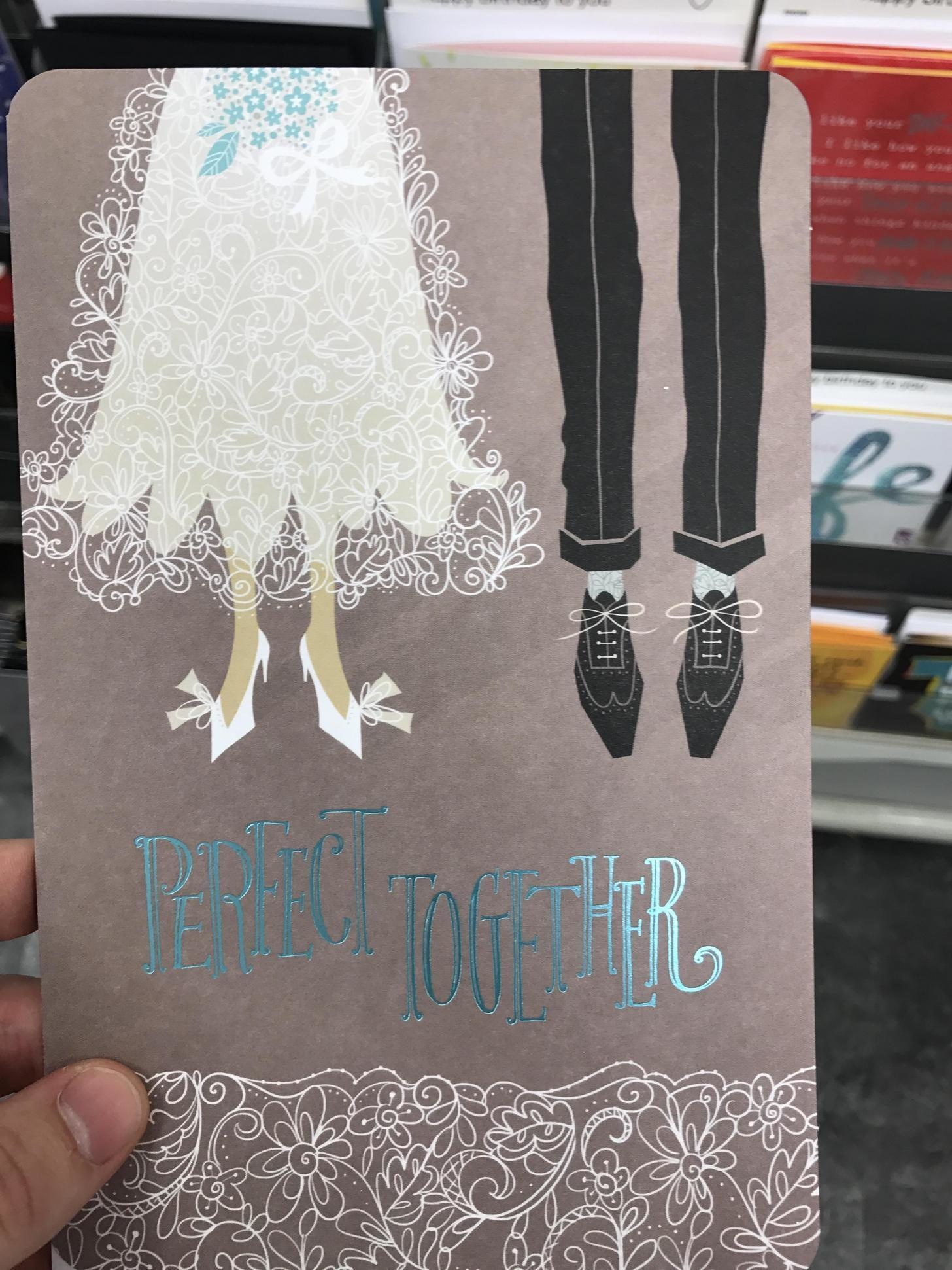
This card has the right intentions, but comes off as dark. It looks like something out of the animated film The Corpse Bride and the font seems to suggest that it’s not a wedding but a funeral.
15. Let There Be Light
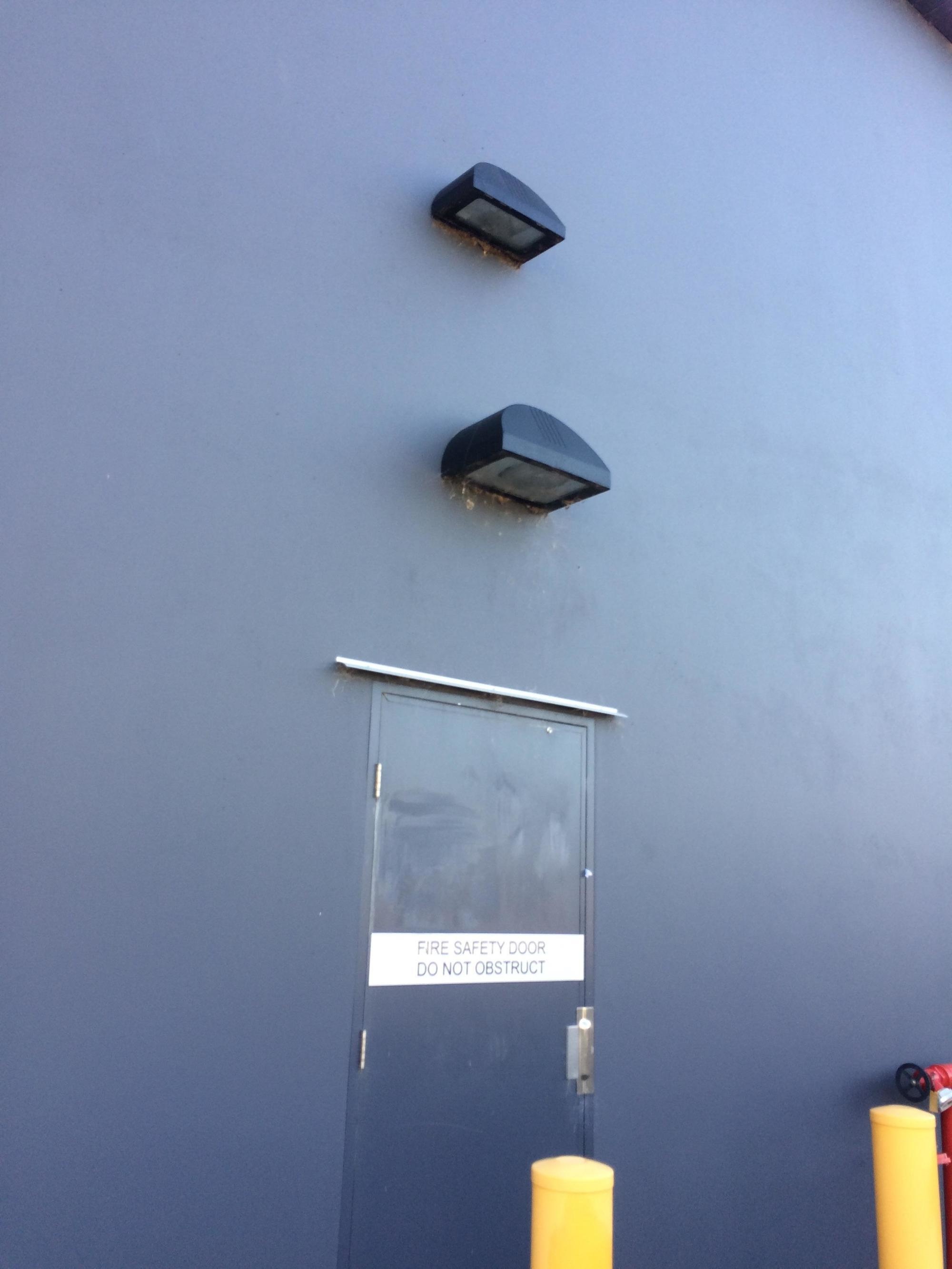
How much light do you need on this one door? I guess the answer was “several lights worth.”
14. Emergency Exit?

Emergency exit into the same room…? Why are exits so confusing?
13. Professional Design
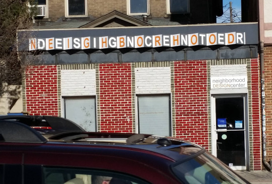
When being artsy goes too far… Let’s go to the old Ndeeisghnocrehnter..
12. Have A What!?
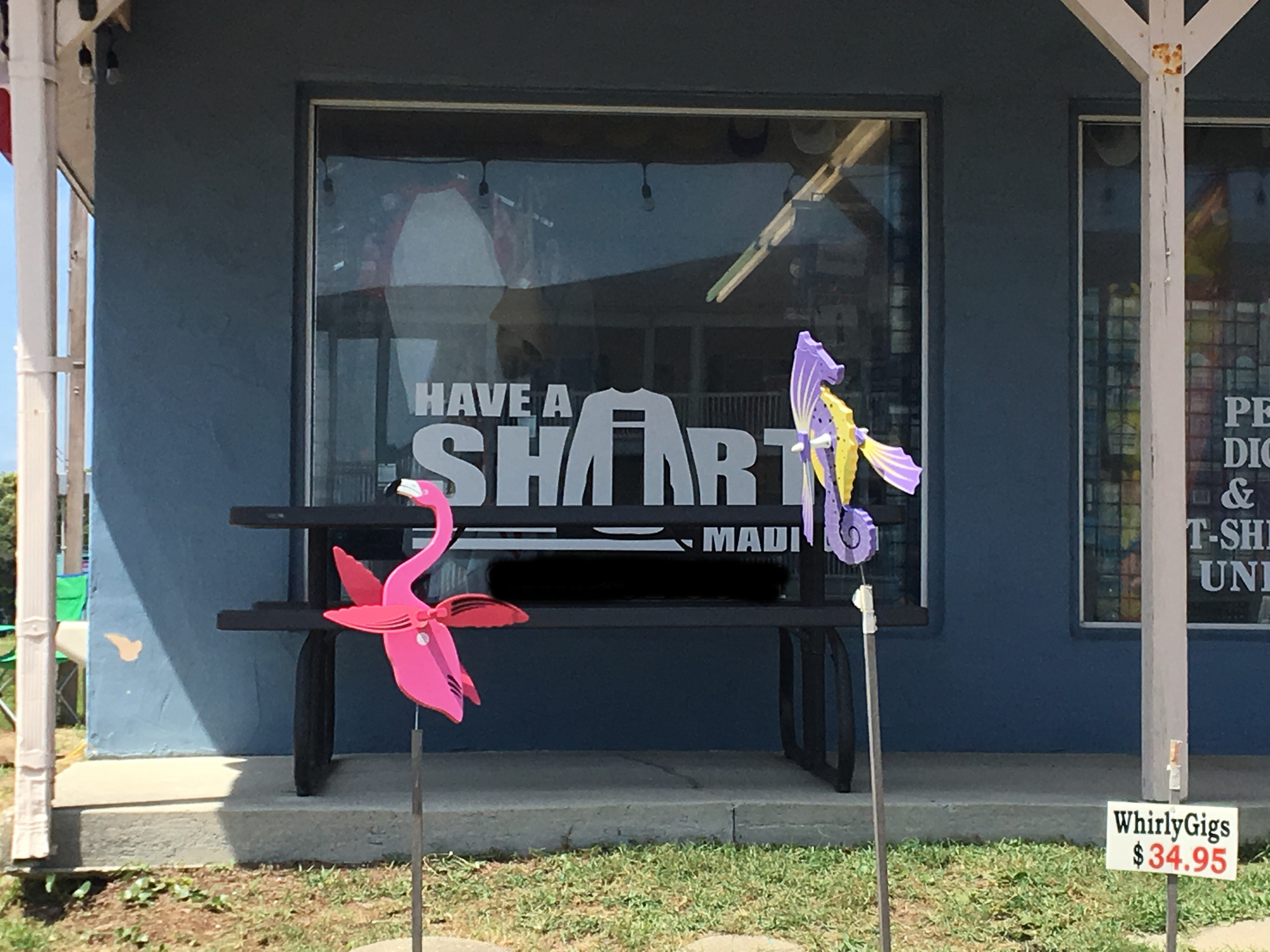
Why choose the letter “I” to put the shirt behind, or why have the shirt at all? It looks like something that’s much grosser.
11. Your Favorite Characters
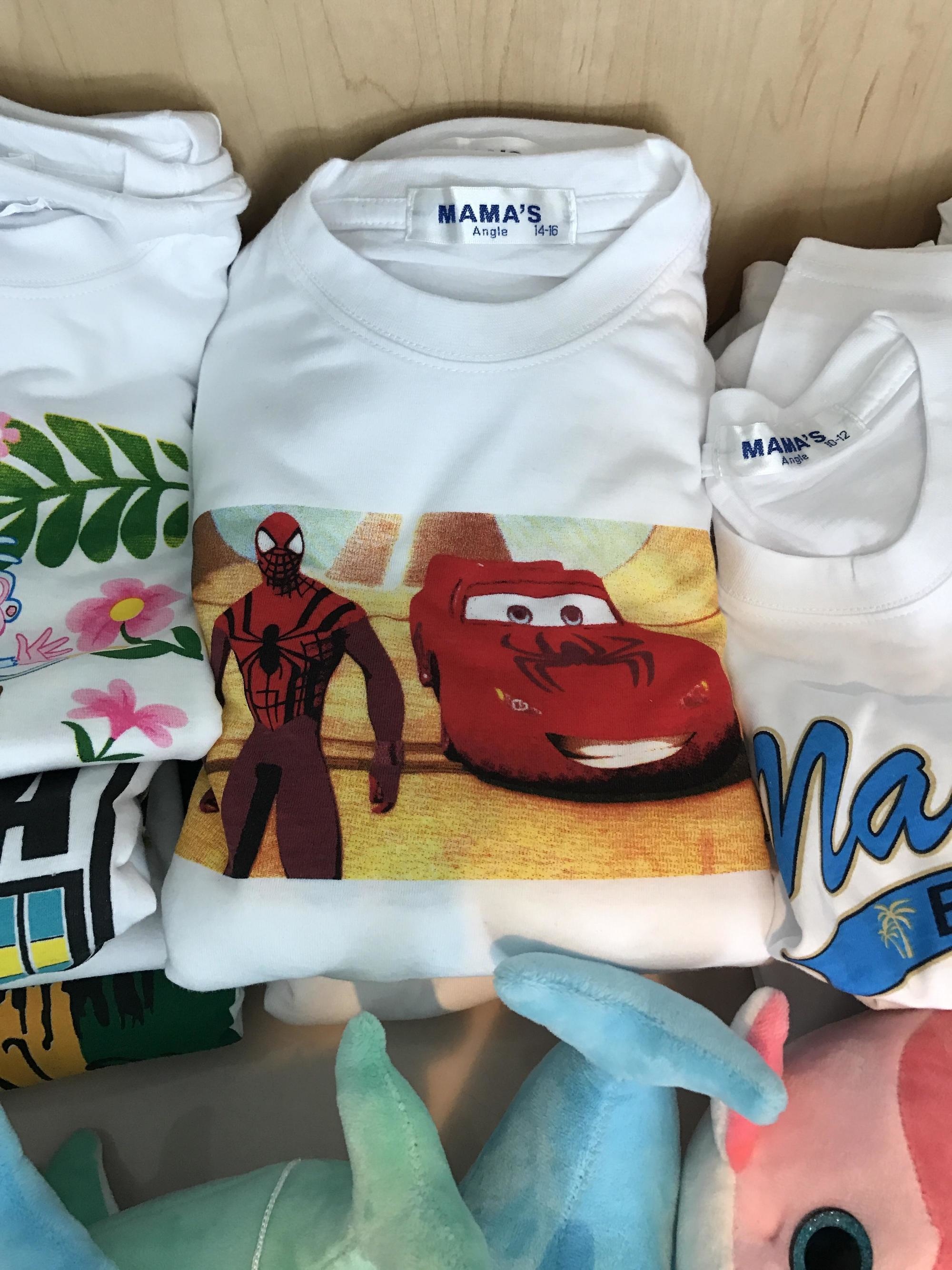
This kids shirt design mixes all your favorite characters from completely different realms! It’s by the company “Mama’s Angle” so there you go.
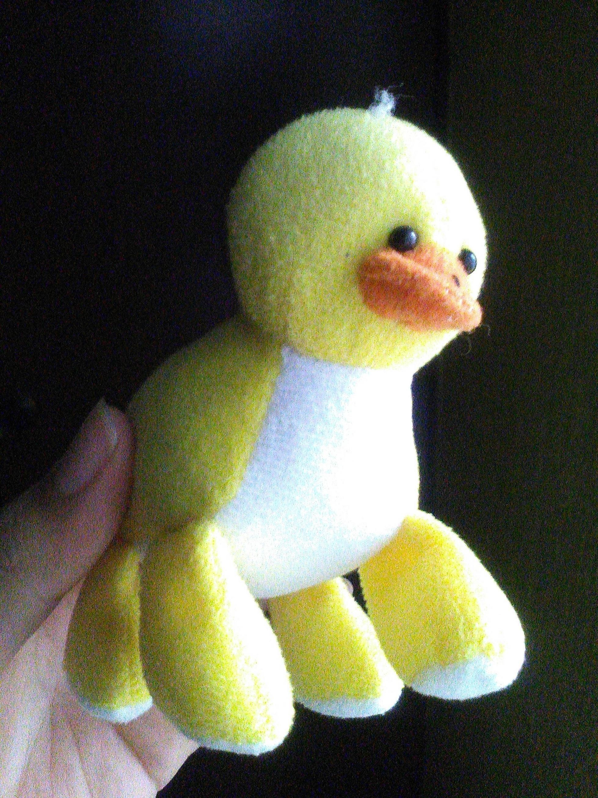
10. Duckephalent
They finally genetically created the Duckephelant, a cross between a duck and elephant!
9. Sexual Orientation
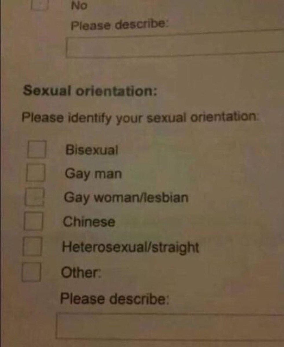
Where’s the gay Chinese option? One of these things is not like the other.
8. High Reach
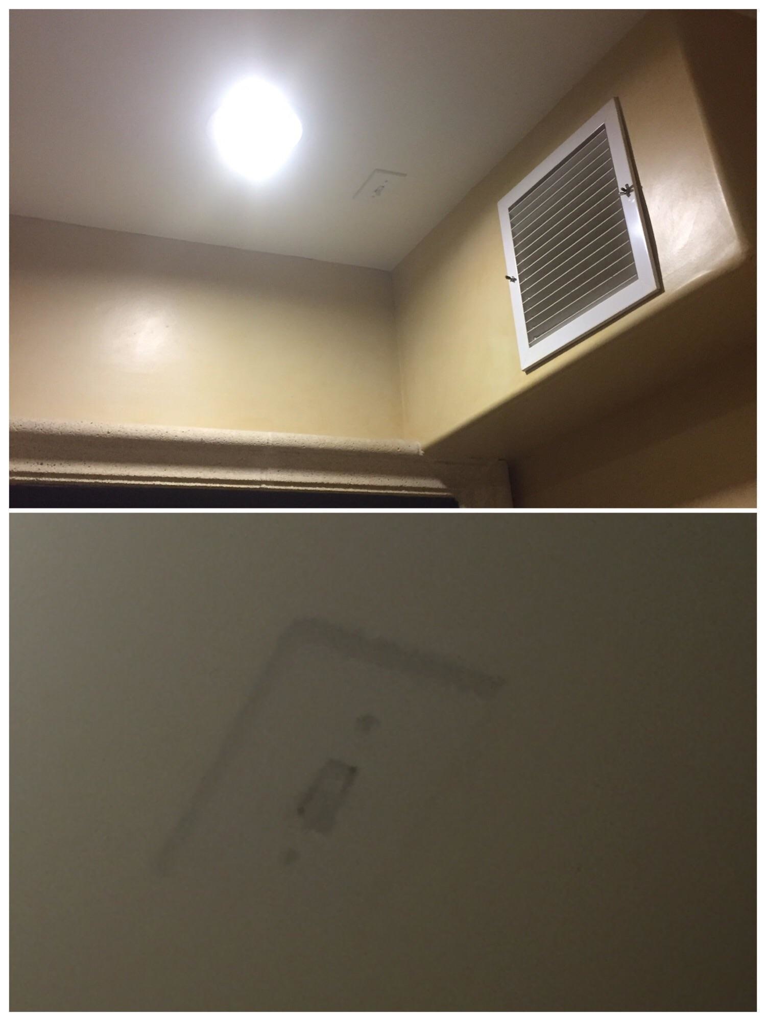
Want light? You have to be at least 8 ft. tall! Get ready to have the light on forever or have a ladder handy!
7. Rise Above
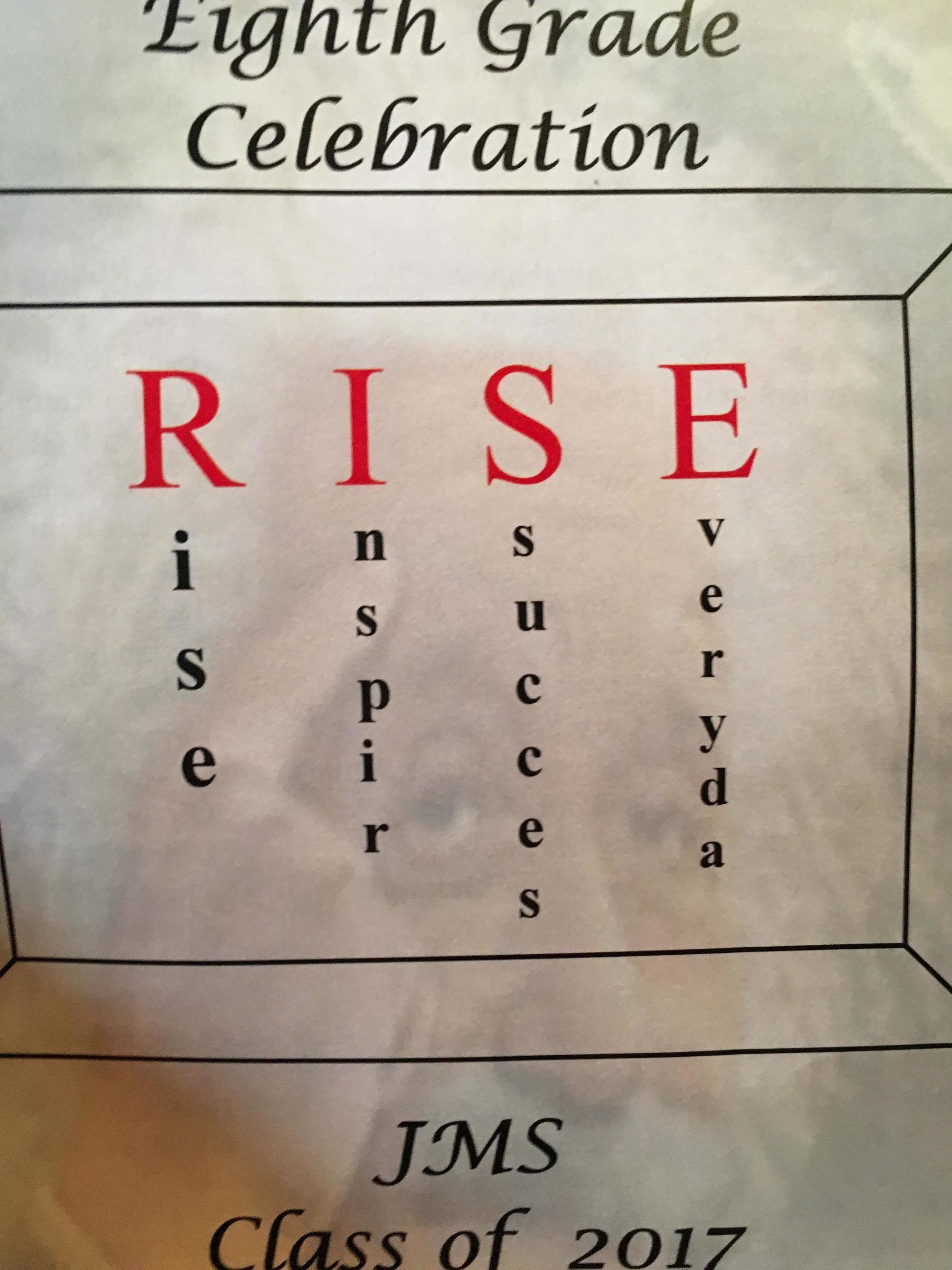
Someone needs to repeat the 8th grade… First Rise was okay but then it all went downhill after that.
6. Human Testing

Are they testing to see if humans can read this convoluted sign?
5. Bad Acronym
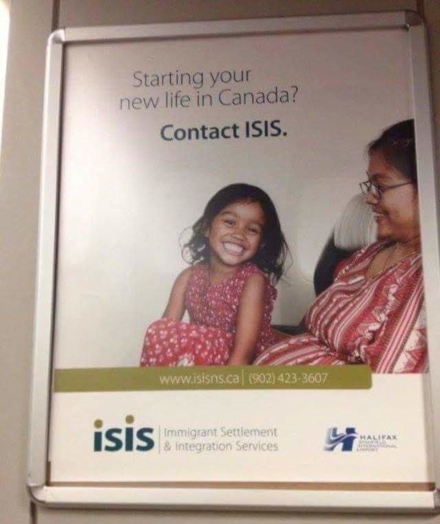
They should look for a different abbreviation… just a little unfortunate in this day and age.
4. Poor Wording

That’s the exact opposite action you’d want to take…
3. Deceased Self
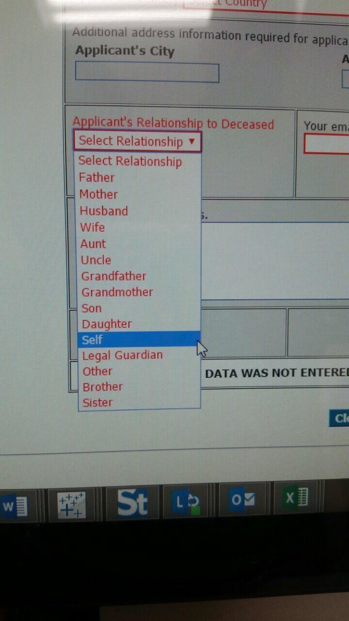
So the deceased are expected to fill out this form as well? Man, paperwork never stops!
2. Accurate Earth?
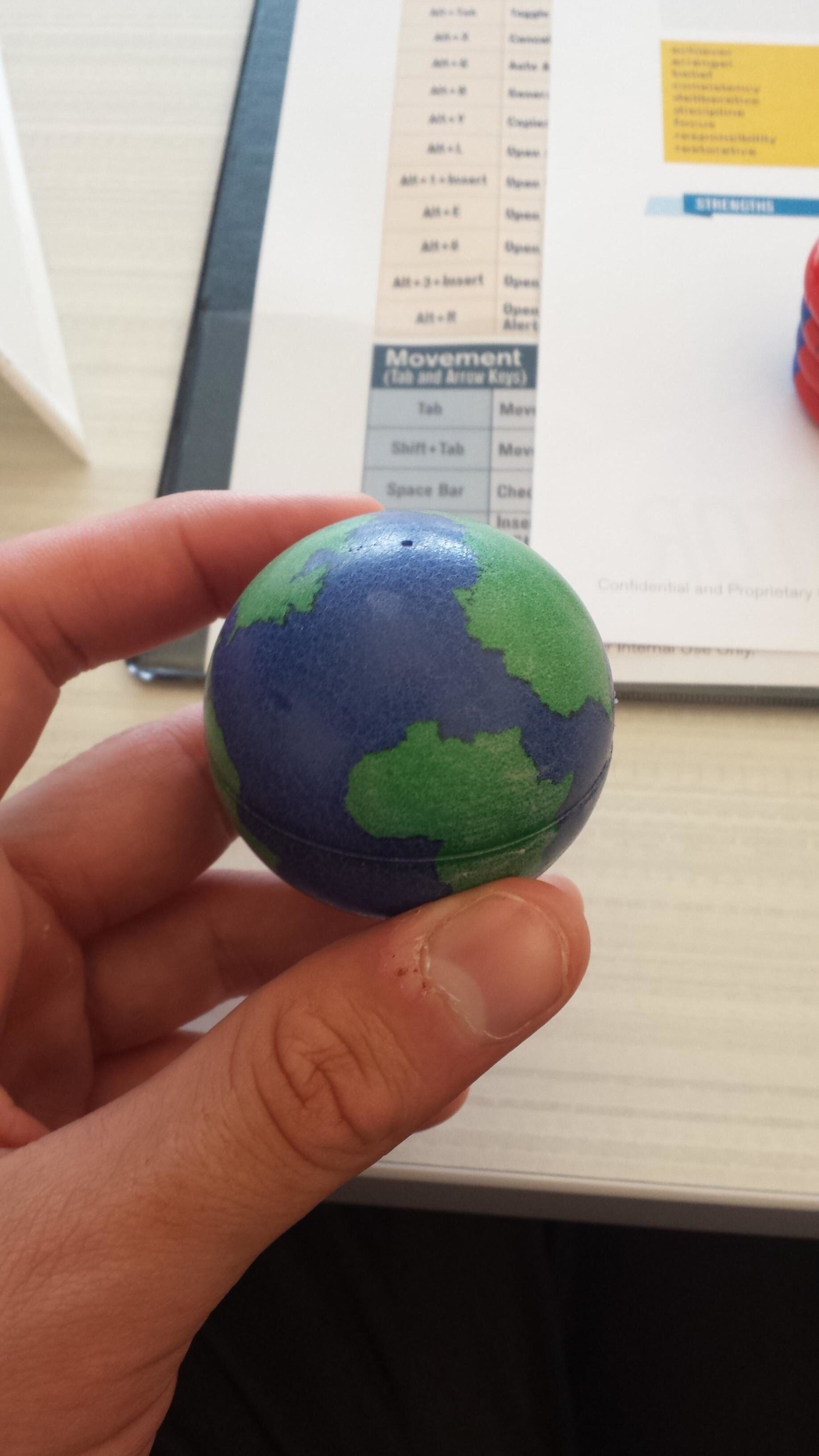
Was this before or after Pangea? Has anyone looked at a globe before designing another globe?
1. Staying Safe

This will definitely stop all this pestering solicitors. Sure.
